Baojiu
A modern Chinese-inspired bakery brand concept that blends heritage with contemporary design.
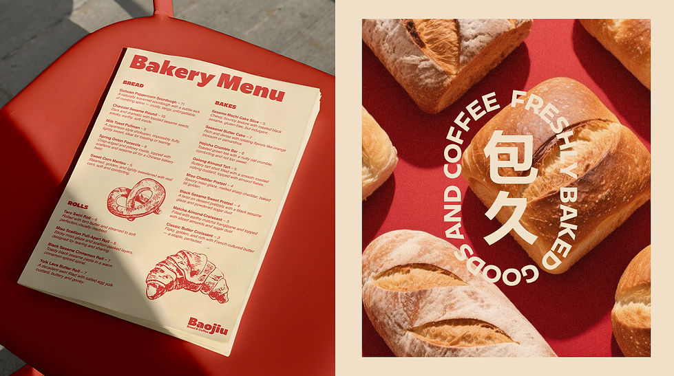
Baojiu (包久)
combines “bao” (buns/bread)
with “jiu” (long-lasting),
symbolising warmth, tradition, and enduring taste.
Role: Branding & Visual Identity
Deliverables: Logo, Packaging, Brand System, Mockups

The Challenge
How can a bakery rooted in Chinese tradition stand out in a modern, design-conscious market? The goal was to create an identity that respects cultural heritage while appealing to an international audience with minimal, contemporary aesthetics.
The Solution
I built the brand around the duality of heritage and modernity.
The design system bridges cultural references with a clean, global aesthetic
Logo: Inspired by traditional Chinese seal marks,
refined into a simple, timeless wordmark.
Color Palette: Neutral tones paired with a bold accent red,
balancing everyday warmth with festive energy.
Typography: A modern sans-serif contrasted with subtle,
character inspired forms to nod at tradition without relying on clichés.
Packaging: Functional and minimal, designed to elevate the
everyday ritual of buying bread into a memorable experience.
The result is a bakery brand that feels rooted in culture yet
flexible enough to exist in an international context.